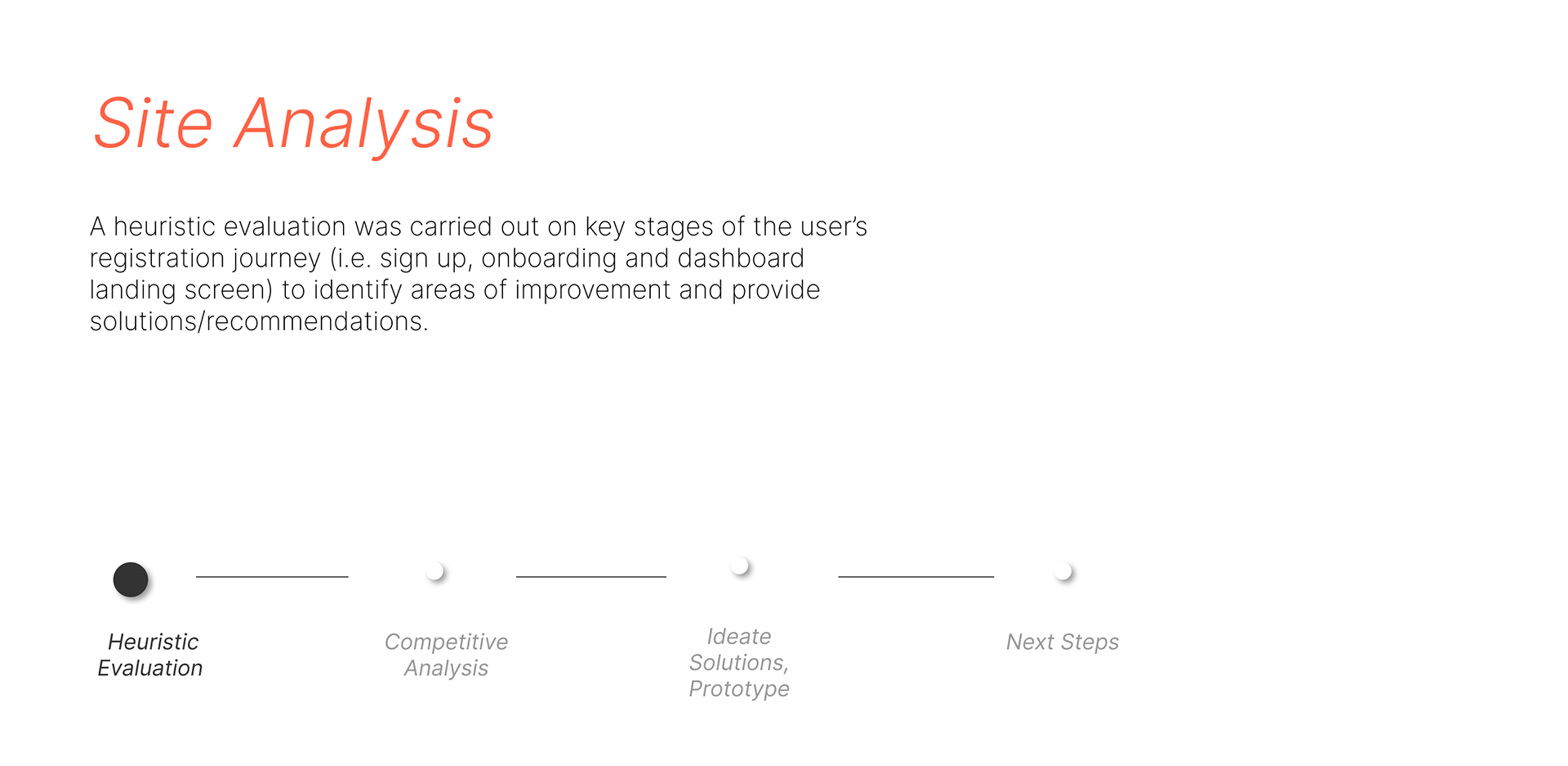
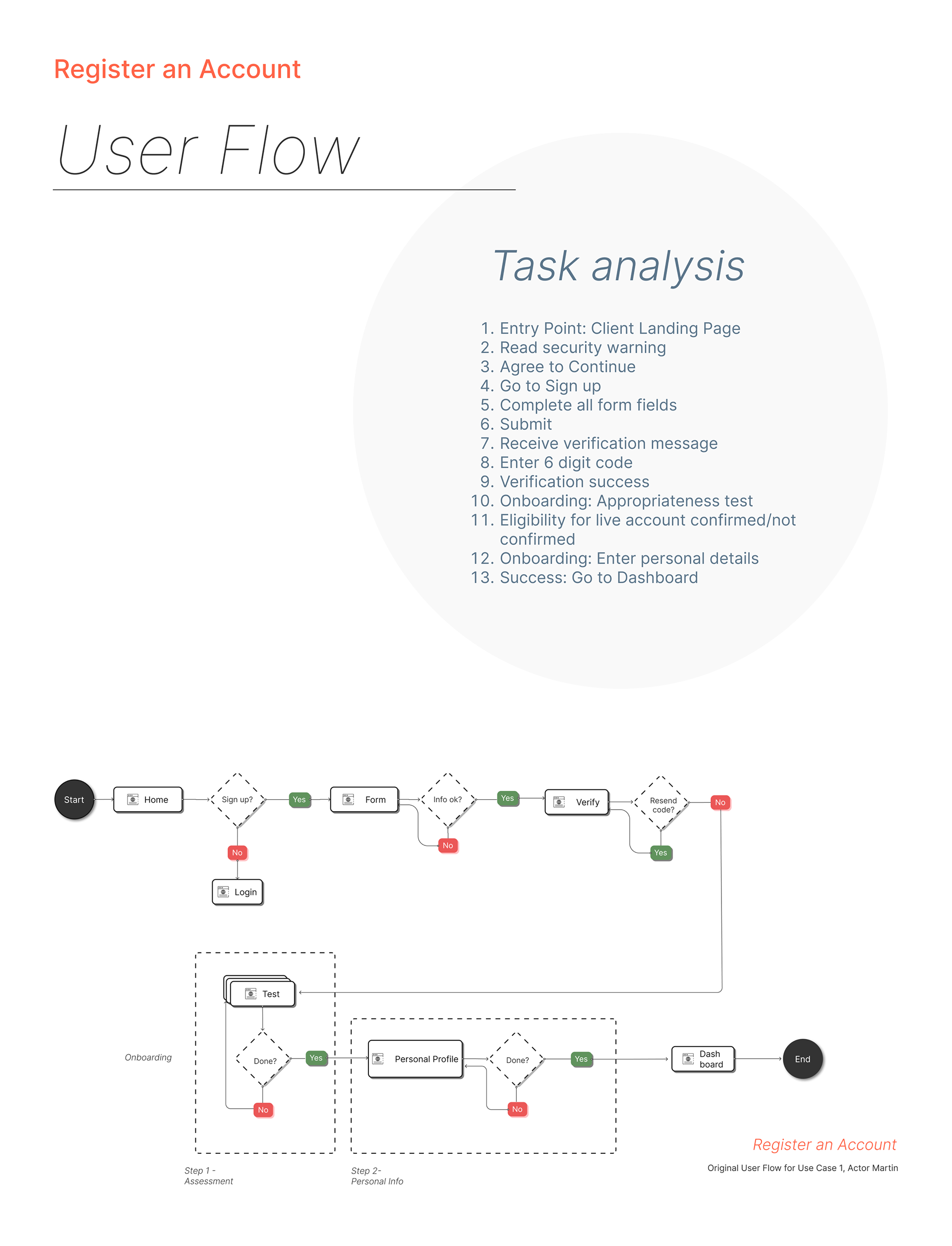
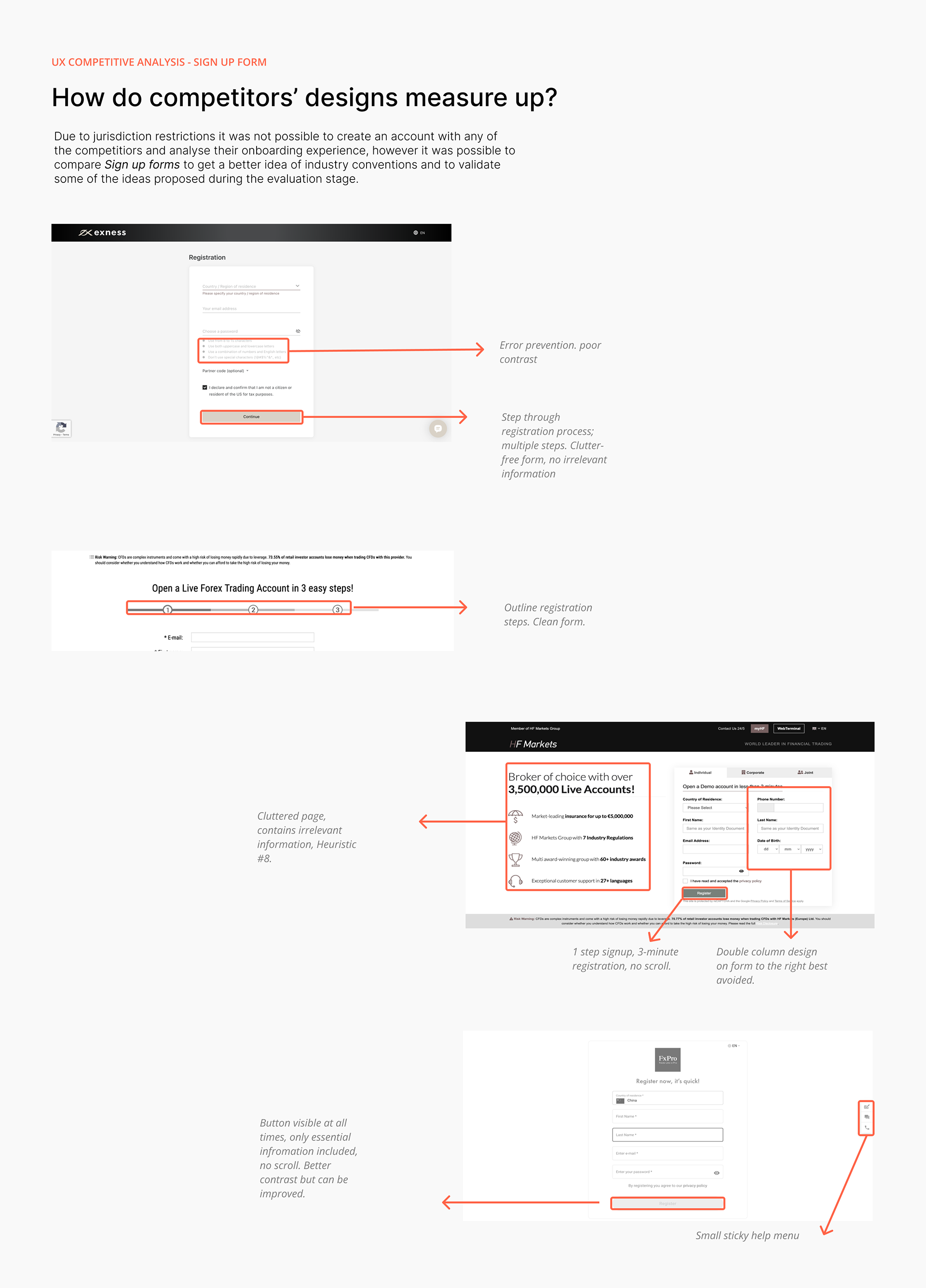
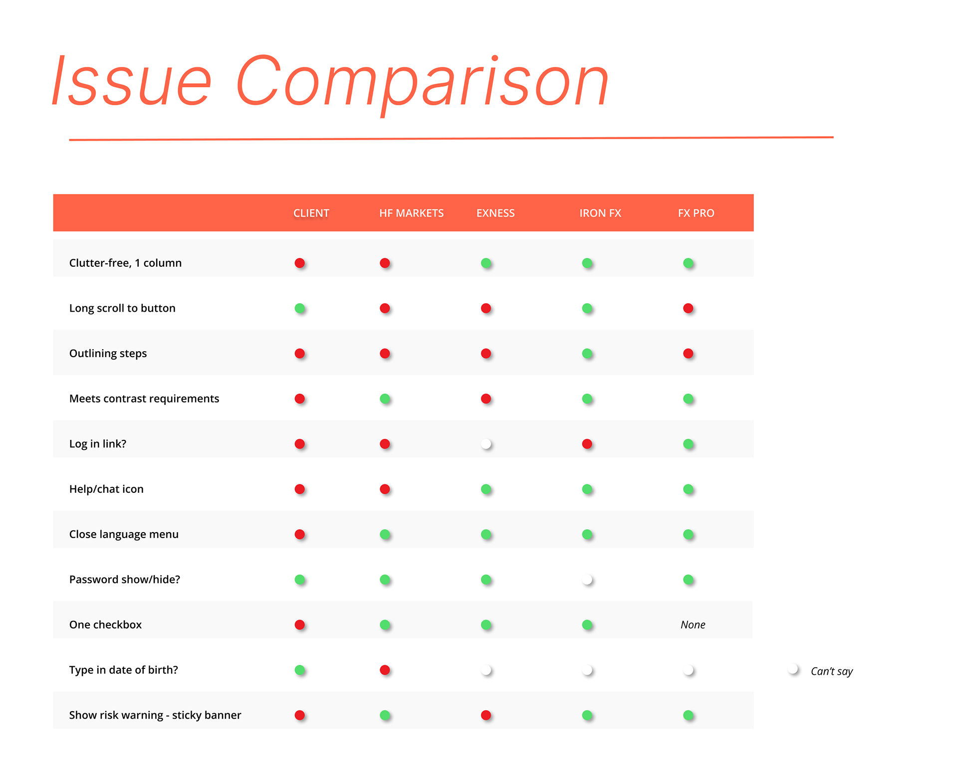
During this 5-day real design challenge, I was tasked to improve the registration experience of a forex brokerage firm and create a UI promotional card for their client dashboard. To approach the first problem, I drafted the existing user flow and conducted a heuristic analysis of the signup and onboarding pages to identify problematic areas and suggest plausible solutions. I concluded this step with a competitive analysis to validate my decisions before re-designing key steps in the flow.
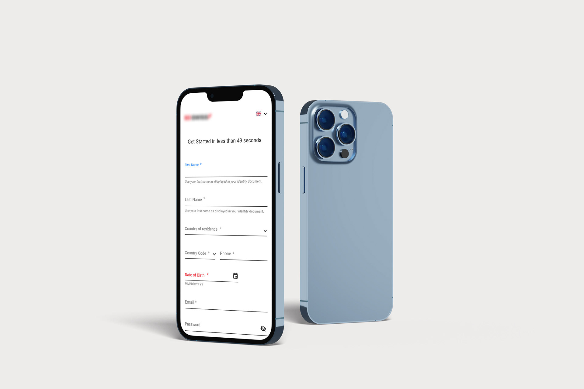


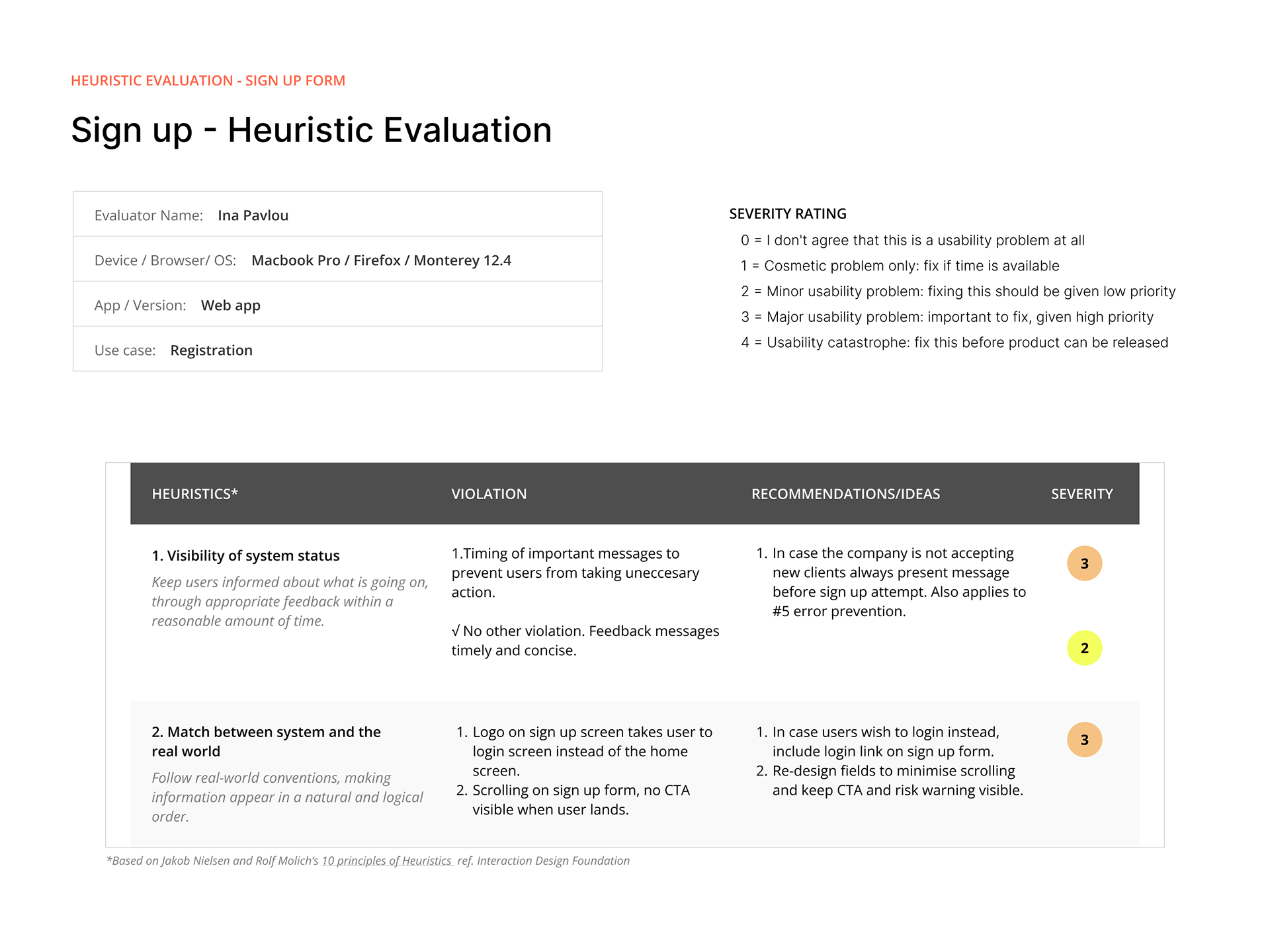
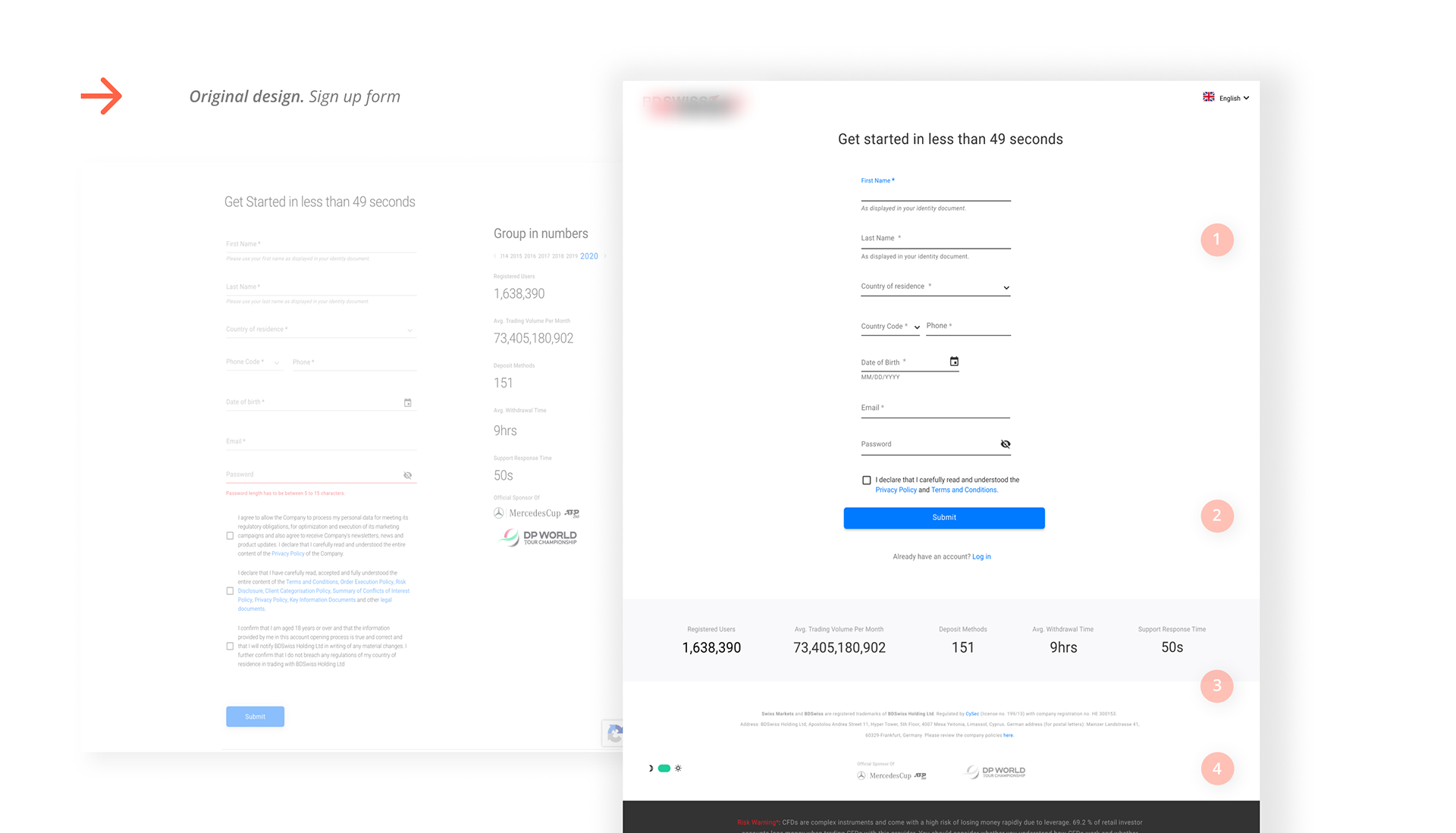
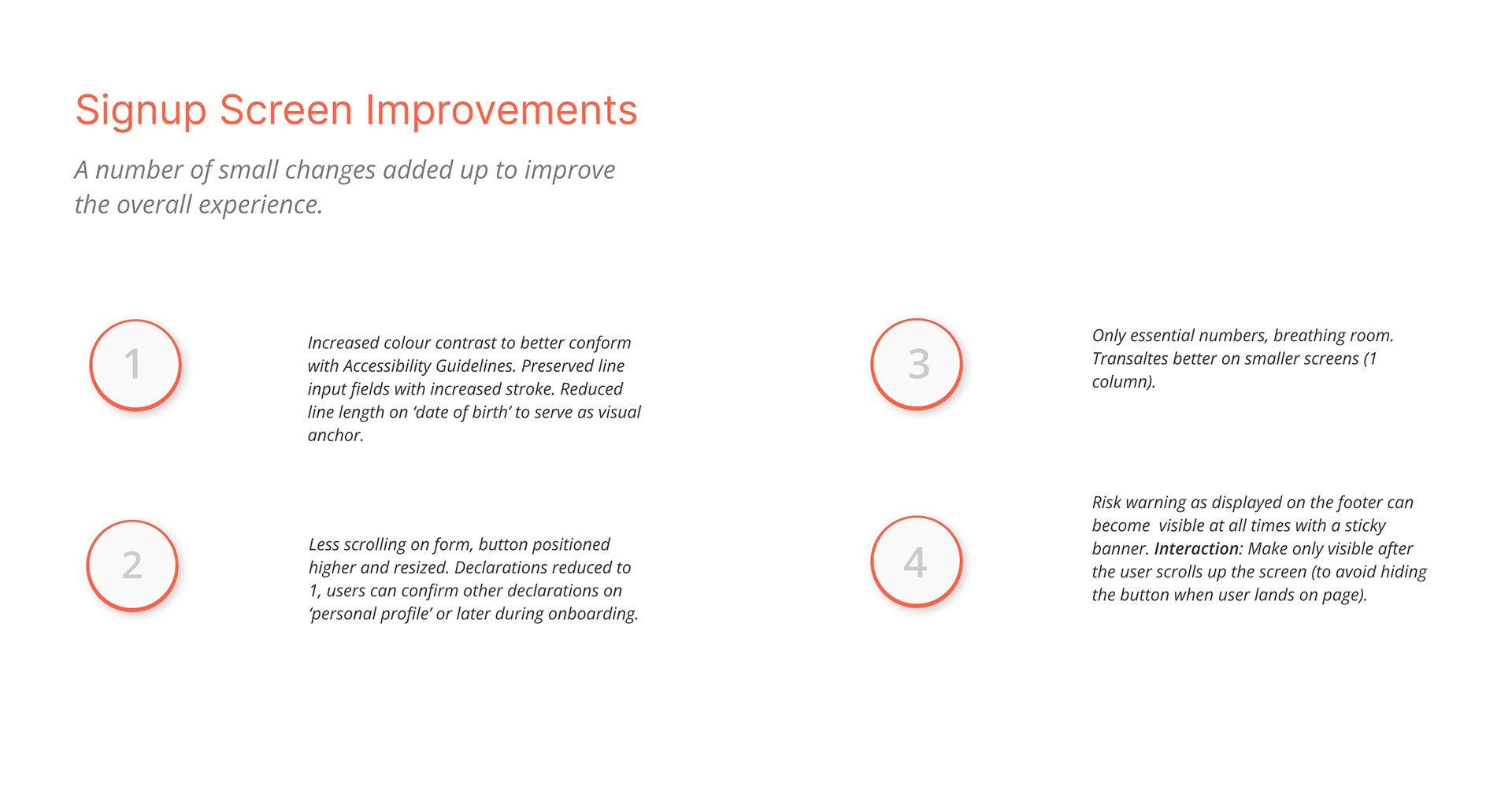
Heuristic Evaluation - Sign up
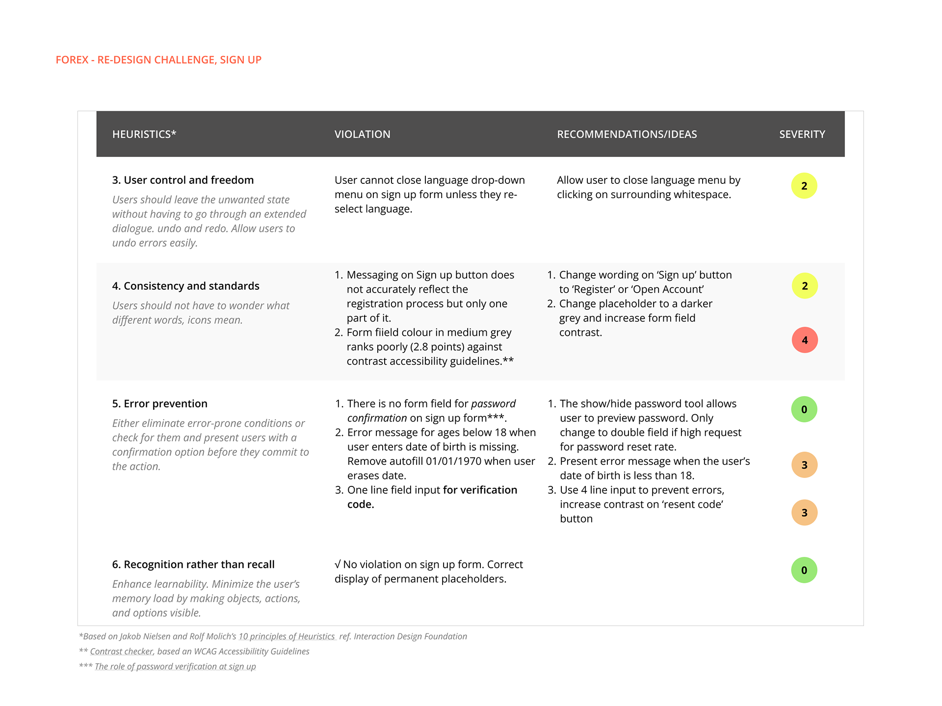
Heuristic Evaluation - Sign up
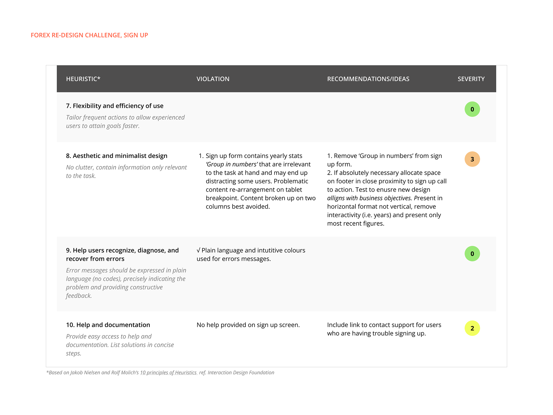
Heuristic Evaluation - Sign up
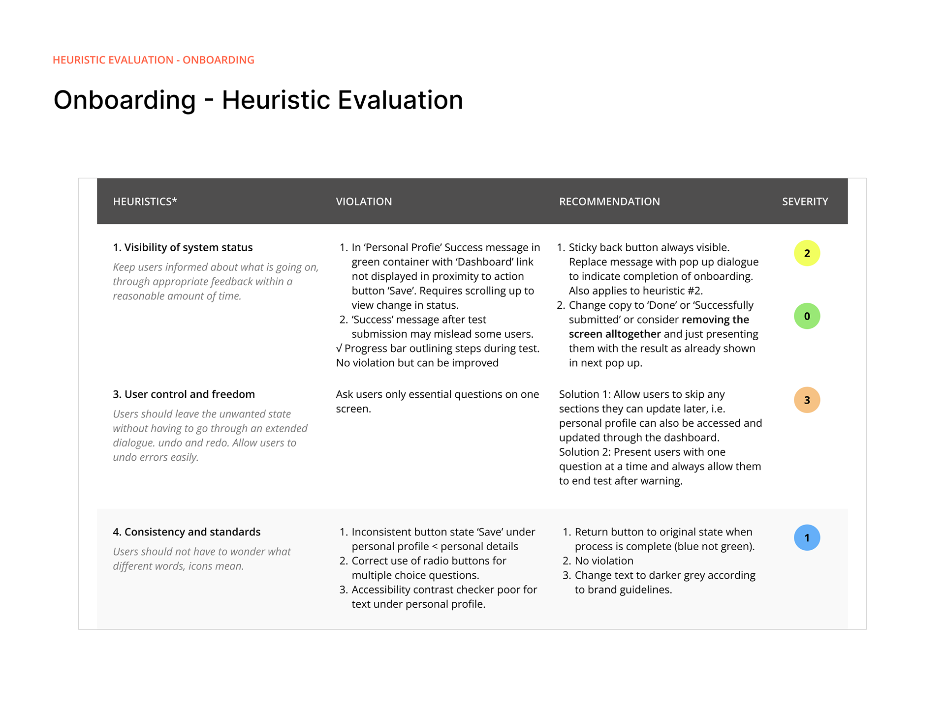
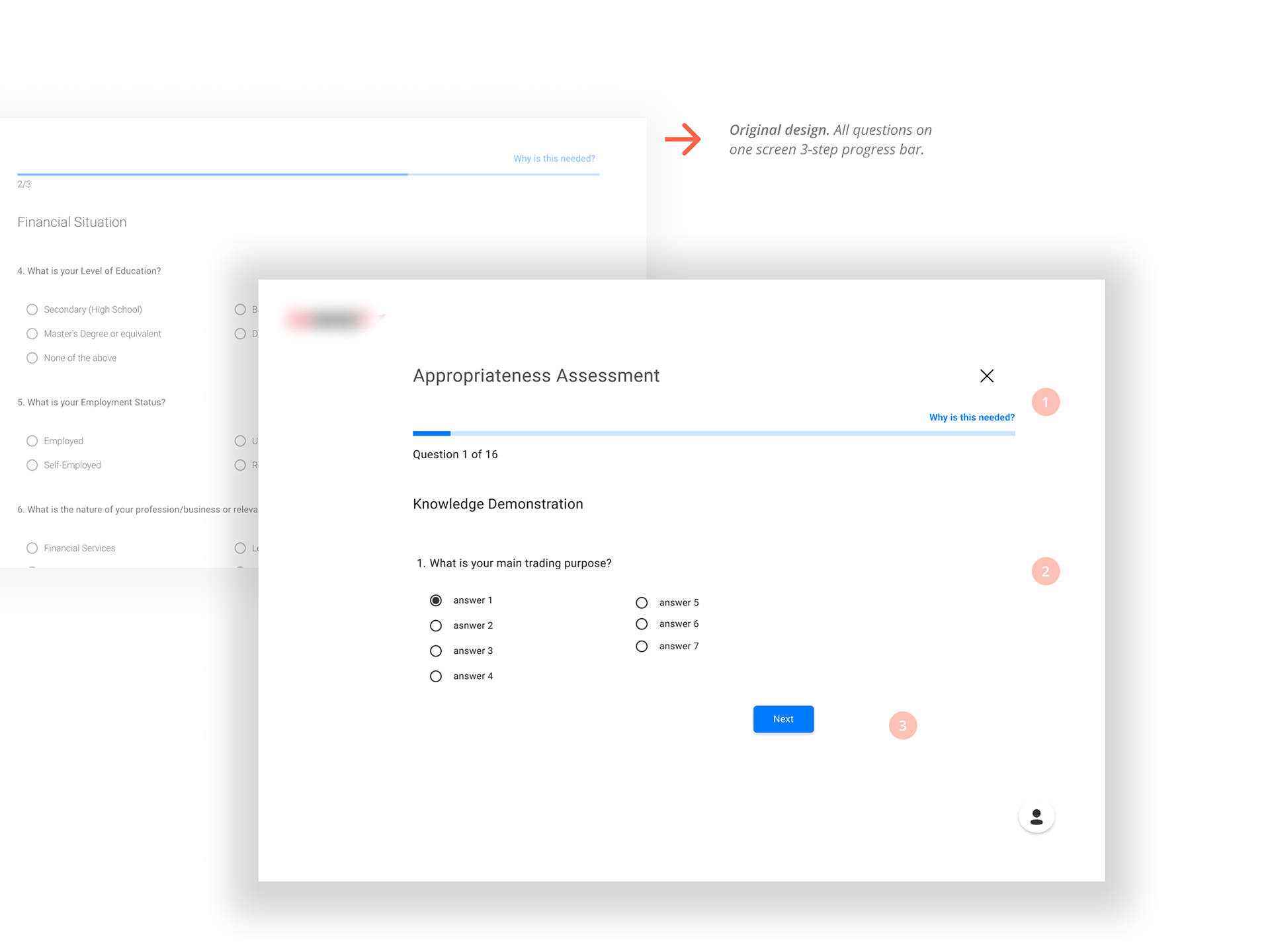
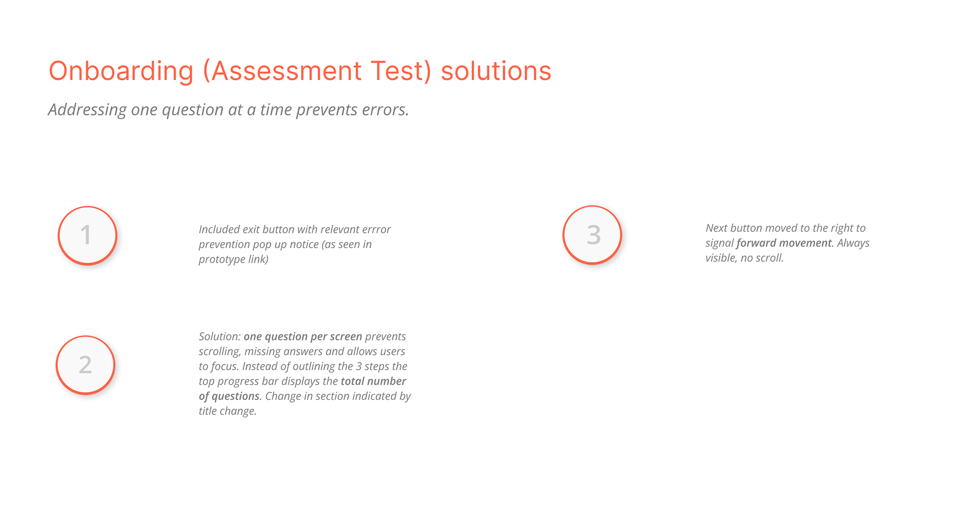
Heuristic Evaluation - Onboarding


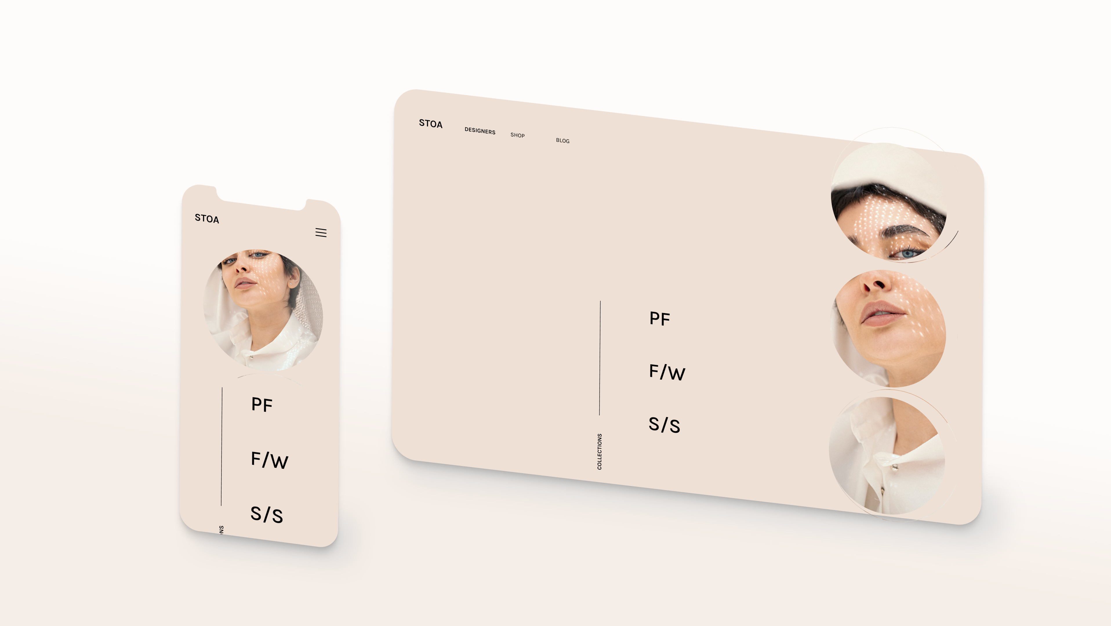
UI Task
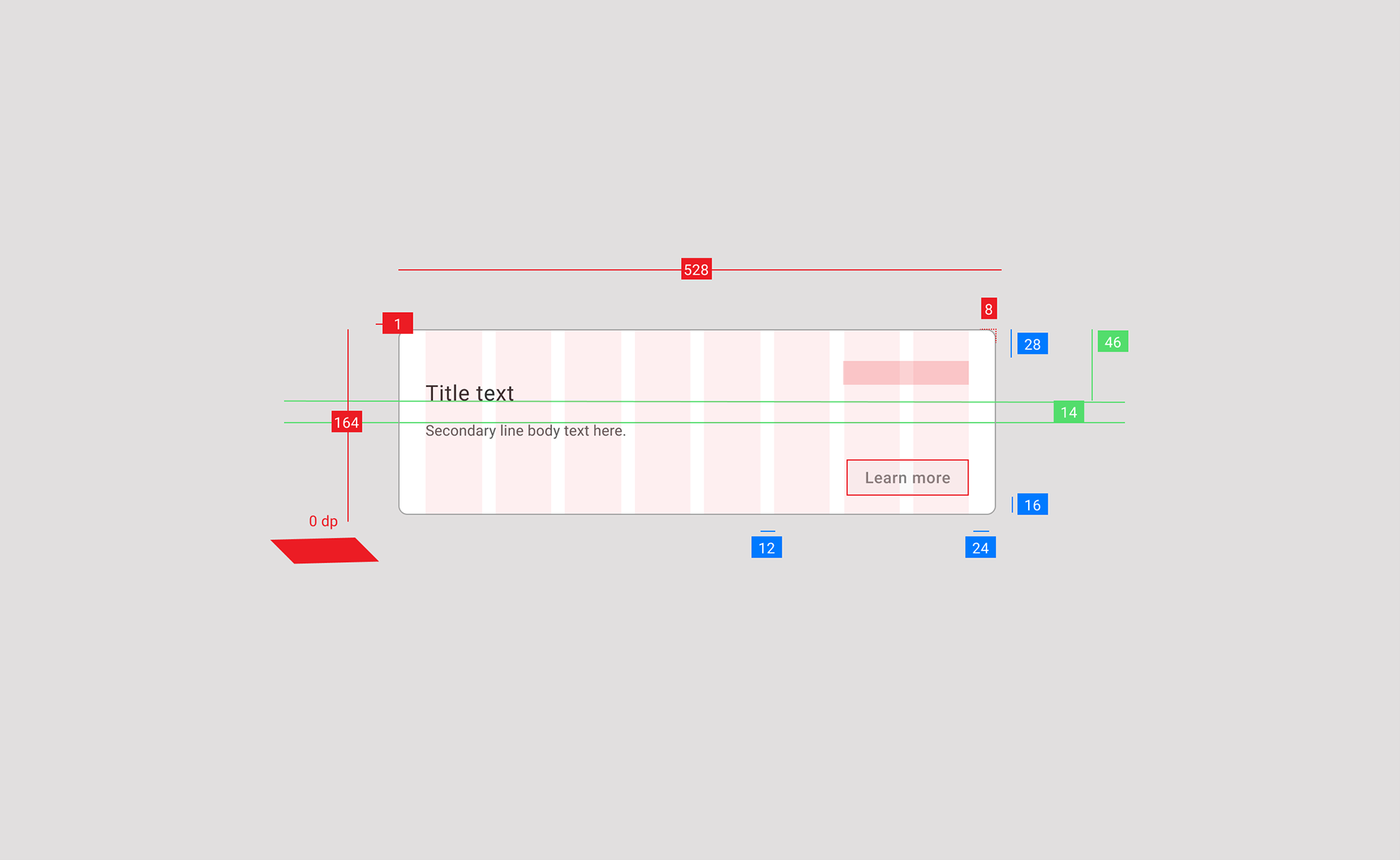
To approach the UI task I researched the company’s promotional materials and competitors’ materials on similar products. To adhere closely to brand guidelines, I extracted brand colours, voice and tone, typography and sizing of cards already in use. By referring to Material Design Guidelines I created a minimal specs annotation to demonstrate the card's layout on the desktop breakpoint. Both the card and contained button length should adapt as column width changes.

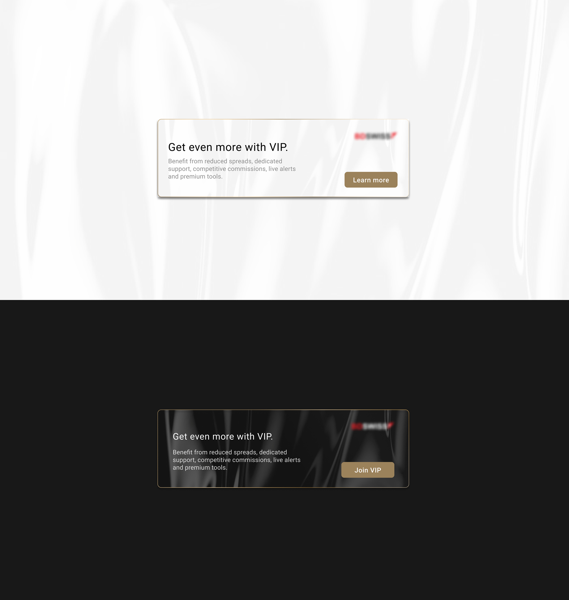
Look and feel
I created a golden gradient effect inspired from a bar of gold and applied it to the delicate rim of the cards to evoke a premium effect. A satin texture was applied as a backdrop to make the card appear more dynamic. Appropriate font sizes were used to establish visual hierarchy. Two versions of the card were created to accommodate light and dark modes.

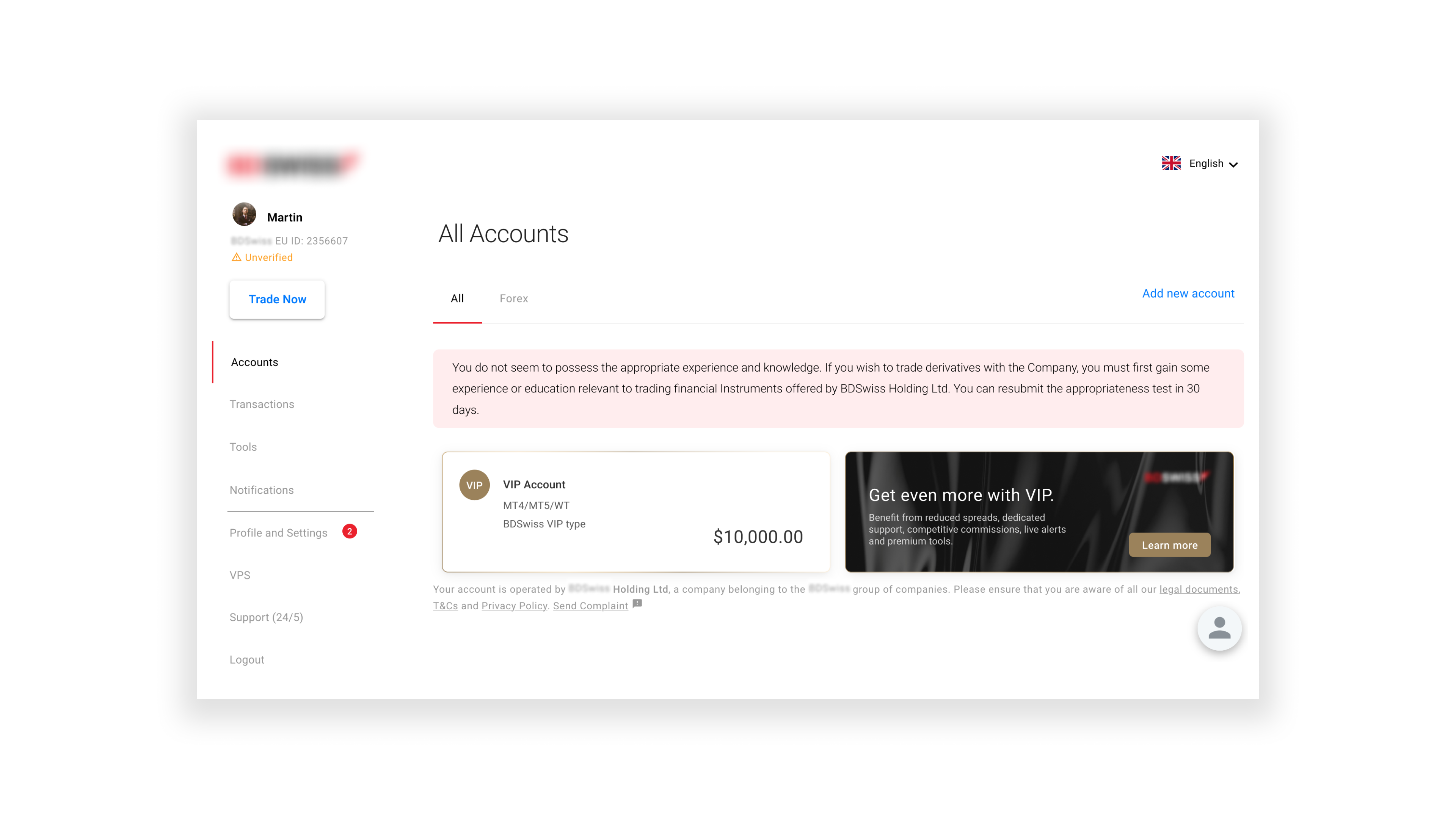
User Dashboard
As proof of concept the card was positioned in context inside the user's dashboard next to the relevant account card for further discussion.